


Idea
Financial Services Volunteer Corps helps build sound financial systems needed to support robust market economies in the transitional and developing countries. Sturdy financial infrastructure is essential to support private entrepreneurship, promote job creation, mobilize domestic savings, attract foreign investment, and create conditions that promote lasting economic opportunities.
Solution
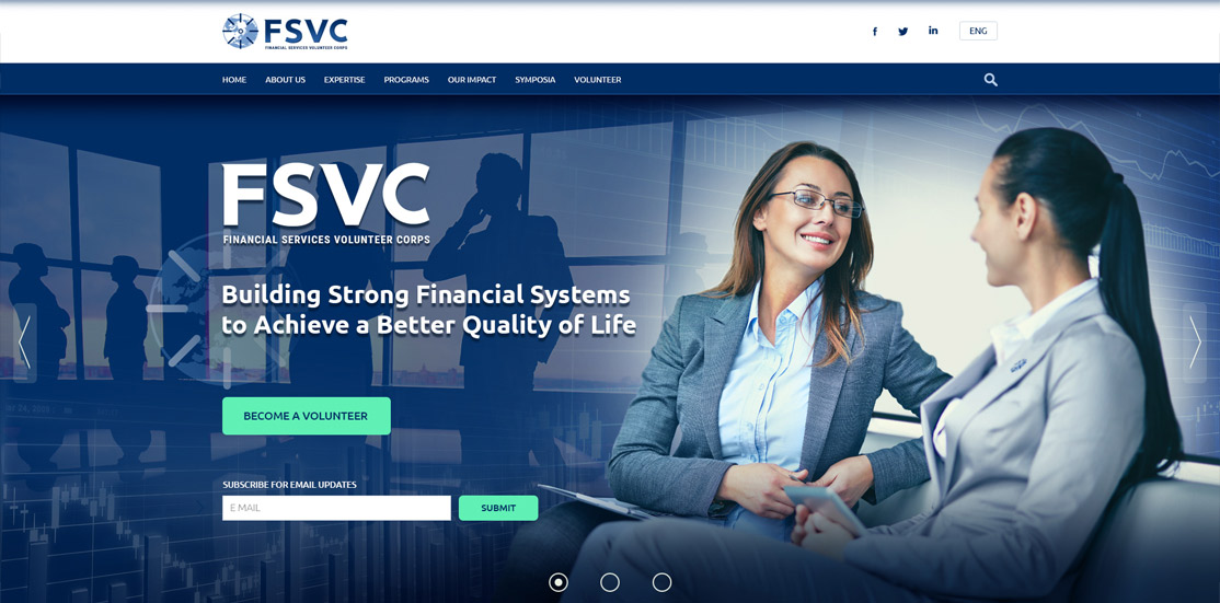
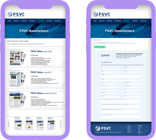
FSVC has a long history, but along with that, it needs to keep up with the dynamics of the nowadays world. We set a goal to refresh their brand and implement modern technologies to make all operations more efficient – building a clean and responsive website for the organization was the main goal. Apart from the new look, we aimed to make interactions with volunteers more convenient, which includes a personal section for each volunteer and an HR system to manage new applicants.

It takes only 0.05 seconds for a user to make the first impression about the website
Apart from the new look, we aimed to make interactions with volunteers more convenient, which includes a personal section for each volunteer and an HR system to manage new applicants.
Any brand starts with the logo, so it was important to focus on the initial look and fit it in the demands of the modern Internet at the same time. It was decided to use a bolder type for the organization’s name, so it could be easily readable on any device. The main color palette for the website remains the same – it is several shades of blue.
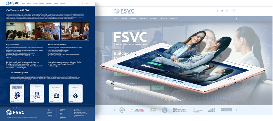
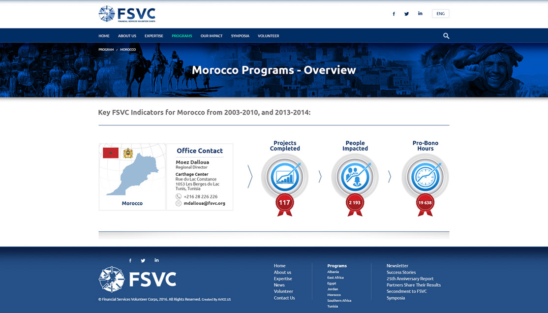
As there were no development efforts on the website for a while, our task was not only to change the design but also implement the latest standards of software development (OWASP requirements, cross-browser compatibility, responsiveness, etc.). As a result, the website looks completely refreshed, it is safe to use and very convenient for visitors.